Popular Sites

Responsive Images
Explains the usage of responsive images to load the image based on screen resolution. It also explains how Device Pixel Ratio (DPR) works and the impact of DPR on the images having appropriate srcset using x value.
In the previous tutorial i.e. Lazy Loading Images, we have discussed the options to lazy load the image based on screen size using a placeholder image. We will continue the same and discuss the options to practically implement the concepts specific to responsive images in this tutorial.
Ideally using a large size image for all the resolutions or devices is not a good solution especially for smaller devices where large sized image consumes more bandwidth which is really not required. Instead of using a single image for all the devices, we can generate multiple images for multiple resolutions. The browser will identify the appropriate image to be displayed. This process of identifying the appropriate image according to screen resolution is supported by almost all the modern browsers.
The Responsive Image Breakpoints Generator is a good starting point to generate responsive images. It smartly generates the images and provides the appropriate HTML. The same can be integrated with the Lazy Loading Images for optimal output.
We can implement responsive images using the options listed below. You can also check the browser support of both
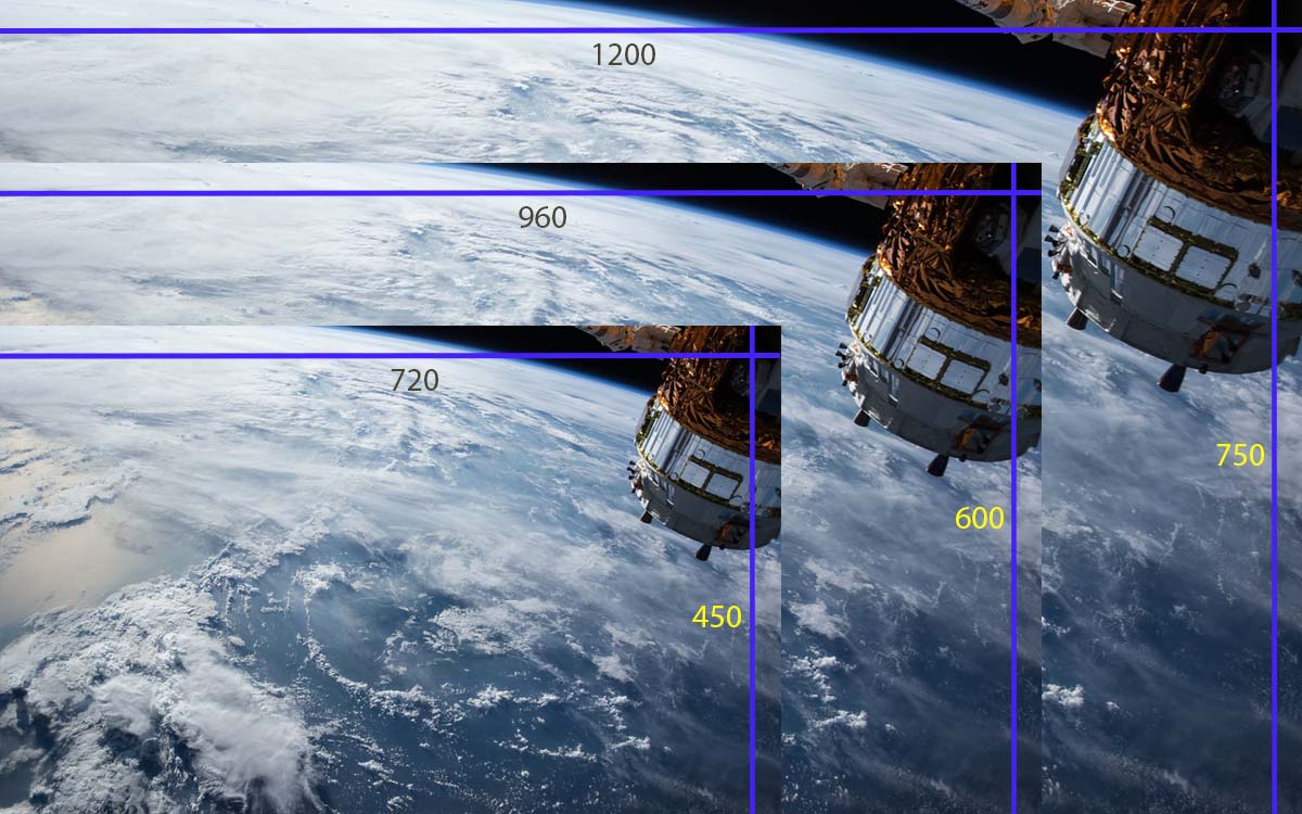
I have used the royalty-free image Satellite Iss International Space for demonstration purpose.
Using the srcset attribute of the Image Tag
We can provide the
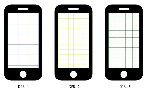
Device Pixel Ratio - The device pixel ratio is the ratio between the physical pixels and the logical/CSS pixels. For e.g. iPhone 4 was shipped with the logical resolution of 640x960 and physical resolution of 1280x1920 with a device pixel ratio of 2. While the iPhone is being shipped with a consistent DPR of 2, the android devices follow different DPR including 1.3, 1.5, 2, 3, etc. The images with high quality will be served to devices having higher DPR.
DPR effect on devices - To understand it better, let's assume the logical resolution as 3 pixels. We can consider 3 device pixels for 1 DPR, 6 device pixels for 2 DPR, and 9 device pixels for 3 DPR for the devices having the same logical resolution as shown in Fig 1. On the larger device, the 3 device pixels will form 1 logical pixel, resulting in a DPR value of 3. The larger image will be sharp on a larger device keeping the same CSS pixel, but more device pixels.

Fig 1
The device will show the image with either 1x or 2x or 3x from the closest options available in the
Zoom effect on Desktop - We can also test the effect of DPR on Desktop. Suppose you own a desktop screen having the physical resolution of 1920 x 1080 or FHD with DPR of 1. Now if you zoom your browser screen to 150%, the DPR will change to 1.5 since the physical resolution remains same, but the logical resolution was decreased by 50 % resulting in an increase in DPR value. Similarly, if you zoom your browser to 75%, the DPR value will change to 0.75 since logical resolution increased in this case. Now reload your browser after changing the DPR value using zoom level. You can clearly observe the URL of the image loaded by the browser depending on the DPR value.
# Image tag having images for 1, 2 and 3 DPR
<img src="image-1x.jpg" srcset="image-1x.jpg 1x, image-2x.jpg 2x, image-3x.jpg 3x" />
Considering the above example, the 2x image path specified in the
Cool enough to guide browsers to load the images based on DPR value, but it does not provide much control.
Using the srcset and sizes attributes of the Image Tag
The newer browsers support both
The simplest implementation of the combination of
# The original image having dimension of 1920 with supportive images for smaller resolutions
<img
	sizes="(max-width: 1920px) 100vw, 1920px"
	srcset="
		image-468.jpg 468w,
		image-768.jpg 768w,
		image-1024.jpg 1024w,
		image-1280.jpg 1280w,
		image-1600.jpg 1600w"
	src="image-1920.jpg"
alt="Test Image">
In the above-mentioned example, we can see that the
The
With these two attributes, we can specify the actual image to be used based on the media queries specified in the sizes attribute. We can have multiple media queries based on the actual scenario to guide the browsers to request the best fitting image from the web server.
We will discuss one more example using the banner image of this tutorial having an actual horizontal resolution of 1200 pixels. In this example, we will restrict the browser to show the image covering 98% width of the viewport if CSS resolution is less than 640 pixels, else the image will cover 48% of the total width as shown below.
<!-- The image -->
<img class="responsive-image"
	src="banner-720.jpg"
	srcset="banner-720.jpg 720w, banner-960.jpg 960w, banner-1200.jpg 1200w"
	sizes="(min-width: 640px) 48vw, 98vw"
title="Responsive Demo" />

<!-- Corresponding CSS -->
.responsive-image {
	width: 98%;
	margin: 1em 1%;
	float: left;
}

@media(min-width: 640px) {

	.responsive-image {
		width: 48%;
	}
}
This means that the larger image i.e. banner-1200.jpg will only be displayed on screens having larger resolution including 4K screens.
In this way, we can control the actual image to be displayed using media queries.
A complete implementation of CodePen is as shown below.
See the Pen Responsive Images by Bhagwat Chouhan (@bhagwatchouhan) on CodePen.
Using Picture Tag
We can also use the Picture Element wrapping up the Image Element to have the same effect as discussed in the previous section.
<!-- Picture Element with source and image elements -->
<picture class="responsive-picture">
	<source
		media="(min-width: 640px)"
		srcset="banner-960.jpg" >
	<source
		media="(min-width: 720px)"
		srcset="banner-1200.jpg" >
	<img
		src="banner-720.jpg"
		alt="Responsive Demo" >
</picture>

<!-- Corresponding CSS -->
.responsive-picture {
	width: 98%;
	margin: 1em 1%;
	float: left;
}

@media(min-width: 640px) {

	.responsive-picture {
		width: 48%;
	}
}
In this example, we are simply using the smallest image on low resolution and larger images as the resolution increase.
These are the possible ways to use multiple images to be displayed according to screen resolution.


